Project Overview
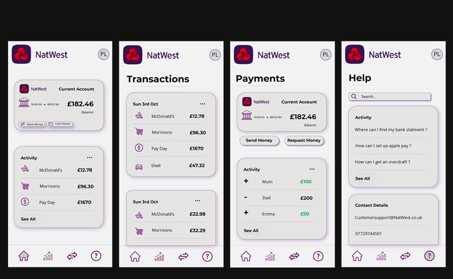
This project came from an AI-generated brief that pushed me to design a clean, user-friendly banking app for NatWest. My main goal was to create a design that not only aligned with NatWest’s branding but was also easy to navigate and visually appealing. I wanted to take everything I’ve learned over the years and build something that showcased my understanding of web/app design best practices.
Consistency in Design
One of the biggest lessons I’ve learned about app and web design is the importance of consistency. Back in college, I worked on a project where I designed a banking app for Barclays. When I look back at that compared to my recent NatWest app, the growth in how I handle consistency is pretty clear.
Consistency touches everything – font sizes for headers and body text, the colour scheme, spacing between components. In my NatWest app design, I made sure that all the square and rectangular components had the same amount of breathing room. The placement and size of the header and footer were consistent across all pages, which gave the whole app a cohesive, polished look. Even small details like pairing fonts that work well together played a huge role in making the design feel unified.
Grouping and Alignment
Grouping and using alignment tools in Illustrator were absolute lifesavers during this project. Grouping components made it super easy to move them around the page and copy them to different places in the design. For example, I could duplicate a grouped component and tweak it with the Direct Selection Tool (A) without worrying about losing the layout or spacing.
The alignment tools also helped keep everything neat and consistent. I used them to line up buttons at the bottom and to make sure different sections were spaced out evenly. It’s these little tricks that make a big difference in giving your design that professional edge.
Colour Theory
Colour choices can make or break a design. One of the biggest takeaways for me has been understanding that using more subtle, calm colours works much better than throwing bright, intense colours at the screen.
For instance, in my college project for Barclays, I went with a bright neon blue as the main colour. At first, it seemed bold and attention-grabbing, but it turned out to be harsh on the eyes and made the overall design feel off-balance.
In the NatWest app, I decided to go with an off-white background instead of a stark white. It created a softer, more inviting look that made the app easier on the eyes. This choice added a touch of sophistication and helped the design feel more polished.
I did the same thing with my personal website. Instead of the classic bold red and black combo, which can come off as a bit aggressive, I chose softer shades. It still stood out but in a way that was easier to look at and more welcoming. These changes in colour choice really showed me how important it is to think about how colours work together and how they impact the overall vibe of a design.
Summary
This project reinforced the importance of consistency, attention to detail, and strategic colour choices in design. Using what I learned about consistency, grouping, and alignment tools, I was able to create a cohesive and visually appealing banking app for NatWest. Applying colour theory, I selected calm and inviting colours to enhance the user experience and create a modern, clean look. These skills will be essential as I continue to develop my portfolio and grow as a designer in my career.